Empowering patients to effectively communicate their medical history
UX/UI designer | Sept 2022 - Dec 2022


WHY - PROBLEM SPACE
the current design resulted in poor completion rate of 76%


screens of the product before a redesign
WHAT - THE GOAL
offering redesign recommendations to increase completion rate of the intake
TRANSPARENT ONBOARDING
increased trust in the product
Educating users what they are expected to do, why they should and who has access to their information, removing any scope of confusion that first time users might have.

what is this intake?

why should it be filled?

who has access to my information?
VISUAL PROGRESS FEEDBACK
increased motivation to complete the intake
Reduces uncertainty about the length of the intake and the amount of time commitment.


why should it be filled?
FAMILIAR INTERACTIONS
reducing cognitive load
Redesigning inputs that users of the internet are familiar with and elevating the look and feel of the product to align it with the brand guide.


redesigned user interface
HOW - RELEVANT INVESTIGATION
research backed design
USABILITY ANALYSIS
usability heuristic evaluations

#1 visibility of system status
Users found the task overwhelming due to the lack of progress indicators, making it difficult to estimate its length or duration.

#4 consistency and standards
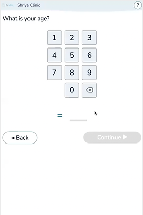
Users were thrown off when they saw an unfamiliar age input. Further, it was very finicky which frustrated them.

#10 help and documentation
Users overlooked the detailed text about the intake, leading to confusion due to unretained information by the end.
ITERATIVE DESIGNS
using behavioural insights
1. Nudging for well-being - In the revised interface, the 'welcome' screen features a crucial notification advising users against engaging with the intake process during emergencies. This enhancement aims to guide users' decisions towards their well-being without compromising their freedom of choice.


before and after screens
2. Minimizing perceived effect - Given the intake's nested logic, the duration varies with each user's symptom complexity. Initially, progress was shown via a screen or modal after each question category. Recognizing the need for a more nuanced approach, I integrated a subtle progress tracker into the main interface, not drawing the user’s attention to its’ length.


iterations of the progress tracker
FORWARD THINKING
going beyond the job description
1. Search engine - Allowing users to report all symptoms simultaneously reduces their mental effort and decision-making burden. This approach empowers patients to share comprehensive details about their health concerns, offering relief and making the intake process more predictable.


wireframes of the search engine feature
2. Summary - Providing users the option to review and edit their health information before submission ensures accuracy and offers comfort, leading to a positive experience.


wireframes of the summary feature
ENDORSEMENT
KEY STAKEHOLDER - CHIEF TECHNOLOGY OFFICER
Huge shout-out to Shriya Maru who joined FirstHx from Emily Carr University of Art and Design’s Design for Startups program. Shriya made a really impactful contribution to our UX, re-thinking, re-designing and doing all the research to make FirstHx’s patient experience even smoother and more intuitive. Thank you!
KEY STAKEHOLDER - CHIEF PRODUCT OFFICER
Shriya Maru is an incredible rising star. It was fantastic to have her work with the FirstHx team. Great contribution, rapidly adapting and innovative mind. I’m sure more amazing achievements still to come!

